| 09-05-2007, 10:32 AM | #1 |
|
hi

98
Rep 837
Posts |
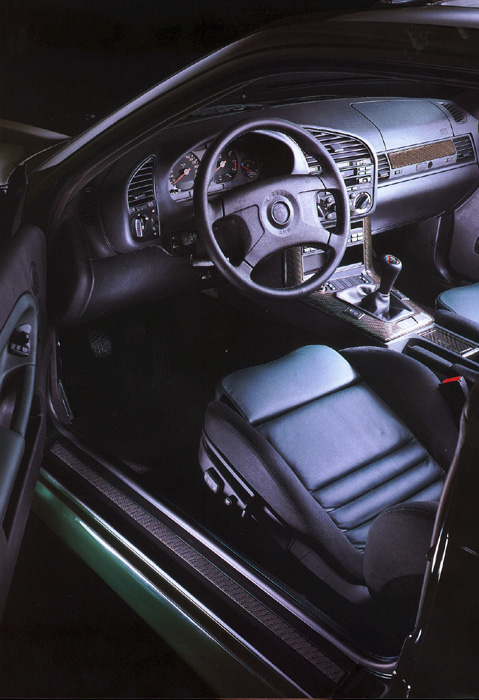
3 series interior evolution
E21
 E30  E36  E46  E90  Just pointing out that, one thing BMW has actually stuck with throughout the years is a very simplistic interior that doesn't interfere with driving. Seems BMW gets alot of hate for their interiors, but I am one of the people who don't care for as much technological buttons and clutter that most automakers put in their cars. I guess I'm in the minority. Last edited by herbz; 09-05-2007 at 05:35 PM.. |
| 09-05-2007, 11:07 AM | #3 |
|
hi

98
Rep 837
Posts |
|
|
Appreciate
0
|
| 09-05-2007, 11:45 AM | #4 |
|
parachute
98
Rep 539
Posts |
that is not an e36 interior, that's an e30!!!
and the e90 interior looks 200% better with sports package and NAV, like the e46 that you're showing. nice pics though
__________________
335i Coupe - LeMans Blue
325i Sedan - Mystic Blue (Retired) |
|
Appreciate
0
|
| 09-05-2007, 11:57 AM | #5 |
|
hi

98
Rep 837
Posts |
|
|
Appreciate
0
|
| 09-05-2007, 12:01 PM | #6 | |
|
Brigadier General
 
391
Rep 4,320
Posts
Drives: '07 Z4 M Coupe
Join Date: May 2006
Location: Metro-Detroit
|
Quote:
The Ultimate Driving Machine should prioritize the driver above the passengers. Plus the new cupholders downright suck. 
__________________
 |
|
|
Appreciate
0
|
| 09-05-2007, 01:52 PM | #7 |
|
Second Lieutenant
 18
Rep 229
Posts |
I actually like the E46 interior better than the E90/92. It looks more aerodynamic to me. I don't like the big blocky styling of the new 3 series.
|
|
Appreciate
0
|
| 09-05-2007, 02:20 PM | #8 |
|
Major
 510
Rep 1,389
Posts
Drives: F80 SO ZCP CCB
Join Date: Aug 2007
Location: Somewhere along PCH...
|
yea the second "camel hump" on the E90 wh navi is odd looking if youreally look at it
__________________
A fisherman always sees another fisherman from afar
|
|
Appreciate
0
|
| 09-05-2007, 02:28 PM | #10 |
|
Recovering BMW Addict

154
Rep 1,914
Posts
Drives: <OO (|||)(|||) OO>
Join Date: Nov 2005
Location: Southeast PA
|
E21 is missing from the series?
 |
|
Appreciate
0
|
| 09-05-2007, 03:17 PM | #11 |
|
Colonel
 
130
Rep 2,740
Posts |
oh ok, the styling of the e36 looks 'updated' now (from the e30)
__________________
 |
|
Appreciate
0
|
| 09-05-2007, 03:24 PM | #12 |
|
Captain
    25
Rep 952
Posts |
Thats cool... but you have to admit its one downfall of styling for BMW's. It looks good but its starting to look boring. My 330 I had before this was built with such quality... thats why I upgraded my interior to CF.
__________________
01 540I - M-sport Premium Package ~ 19' HP Evo Staggerrred ~
 |
|
Appreciate
0
|
| 09-05-2007, 05:35 PM | #13 |
|
hi

98
Rep 837
Posts |
Yup, in the older models, the dash was tilted toward the driver. Starting with the e90 I believe, the dash is straight ahead. Which sucks. But I still find that all the 3 series interiors are similar.
|
|
Appreciate
0
|
Post Reply |
| Bookmarks |
| Thread Tools | Search this Thread |
|
|