| 12-17-2012, 03:17 PM | #25 |
|
Gateropode
332
Rep 2,846
Posts |
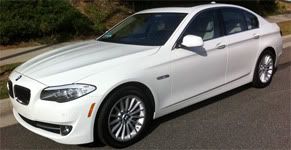
These headlights are over the top. Like they had to do something spectacular because everybody else does, and it looks ugly and weird. Better than the previous ugly one, but still not good looking. Try again?
|
|
Appreciate
0
|
| 12-19-2012, 12:45 AM | #27 |
|
Major
 44
Rep 1,134
Posts |
|
|
Appreciate
0
|
| 12-19-2012, 02:10 AM | #28 |
|
Captain
    193
Rep 895
Posts |
I don't think that the current generation E-class is ugly. I would hate to call it polarizing but the side profile leaves a lot to be desired as it looks as if the car is slanted.
|
|
Appreciate
0
|
| 12-24-2012, 10:38 PM | #32 |
|
Colonel
 
493
Rep 2,197
Posts |
|
|
Appreciate
0
|
| 01-01-2013, 08:59 AM | #34 | |
|
Lieutenant
   
23
Rep 490
Posts |
Quote:
Can this really look this bad O_O
__________________
2011 535i Alpine White, Oyster on black interior, Premium 1 & 2 Package, Magnaflow Full Cat-Back Exhaust, JB4 Stage 2
 |
|
|
Appreciate
0
|
| 01-05-2013, 05:17 PM | #37 |
|
First Lieutenant
  147
Rep 316
Posts
Drives: Sold - e90 335
Join Date: May 2011
Location: USA
|
i like the inside... the outside is just off and odd.
|
|
Appreciate
0
|
| 01-06-2013, 10:36 PM | #39 |
|
Prime Minister of México.

19
Rep 52
Posts |
I hate when one of the cars gets a new design, Mercedes adapt that design to all their vehicles despite doesnt fit them.
When the SLS was produced what happends... all the Mercedes were forced to look like the SLS and who are the first victims? The SLK and the SL. Same when the SLR McLaren, the SLK (previous generation) looks like a baby SLR McLaren attempt. Whats next? Sheez! |
|
Appreciate
0
|
Post Reply |
| Bookmarks |
|
|